The Breathing Office in Kerala, Manjeri city by Architect Uvais K
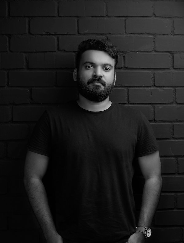
The Breathing Office in Manjeri is a story subtly nestled in the process of being given illustrious shape to its space by the architects from the Tropical Architecture Bureau lead by Architect Uvais K.
This story is set deep in a tropic centre of the world – Kerala. A place that immediately transports you to lazy days by long sandy beaches, the sounds of crashing waves, the tranquil backwaters, palms trees gaily waving their arms up in the humid breeze – a cove of solace.
But in a city called Manjeri, in Malappuarm, these attractions have taken a back seat to give way to concrete buildings, noisy roads, monotonous transport, and tired individuals who tug themselves and their lunchboxes to work in rows and rows of dull coloured buildings with tiny windows and no promising views – classic Taylorism. Offices, today, are rooted in the interaction of the employees – communication, coordination, conversation, etc. and the users must be consciously aware of their spatial context while engaging in these functions.
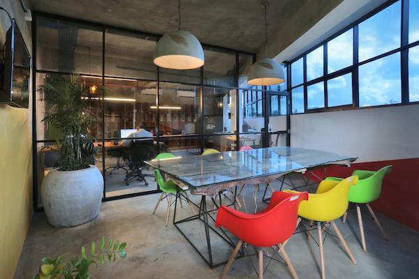
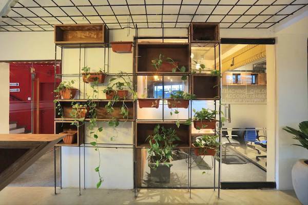
To that end, the architects at TAB trusted in the power of unconventional and varied use of local materials and skilled labour. Work like this is physical proof that somebody has taken joy in beautifying a space for another and there is something so wholesome about the “human touch.” The technical details lie within simple, achievable, and more importantly, economical limits such that it serves as a prototype which maximizes human energy and efficiency in the workplace. The architectural elements together harmonise in warm tones of the exposed finish of metal, cement, and wood without becoming monotonous or visually strenuous by occasionally breaking it up with vibrant spots of bright colours, large-leafed plants, glass partitions, and graphic signages.
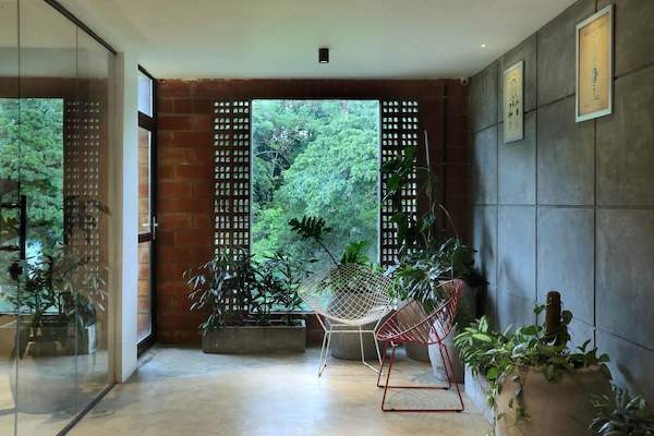
The generous placement of greenery creates the oneness with nature which is absent in the center of the city and is a necessary requirement when advocating for sustainability. The use of glass has been used to admit ample daylight and create an apparent sense of large spatial scale and volumes. Since the crowd of employees is young, it keeps with modern themes unlike the conventional cooped up workstations in olden style offices. There is a certain sense of transparency and personal connection between the users and the spaces, induced by the use of exposed raw materials.
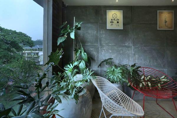
Brick and concrete are the two major materials and not having covered it up with cladding or plaster, portrays the building in its skeletal form and breathing with the users inside –as if it is still in the process of, itself, being a building. The variation in textures brought about by the diversity in materials creates for a truly enriching spatial experience using all the sensory organs. One can see a range of colours in a unified palette but also run a hand on the cool hard concrete, the ridged bricks, the granular mortar in-between, the smooth leathery leaves, the ribbed wooden surfaces, satiny metals, and soft upholstery. The architects have, thus, painstakingly incorporated elements in the material spectrum, creating a unique and varied experience each time.



Hello sir