Architect Anil Panchal from The Spatium Interiors has designed a 3BHK apartment at Lodha Belmondo, Pune, a very beautifully planned township having breathtaking exteriors and amazing ventilation in all rooms. Our clients Mr. Rajiv and Aarti Bagad, residents of Nigeria were quite clear that they wanted a home which is cozy, warm and fresh with a touch of Indian design elements. They also had a few collectibles during their travel which they were very specific of and were very sure of their placements. It is quite a challenging job to team up with clients who are very well aware of what they want.
Entrance lobby is quite dramatic with slits in the ceiling and a similar pattern is continued on walls with the use of veneer and mirror. The credenza top is finished in veneer and the shutter and drawers are done in MDF 3D decorative panels finished in white Matt Duco finish. Long vase is an artifact purchased from Jaipur and a few of their collectible are placed in this lobby.
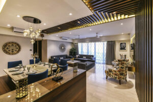
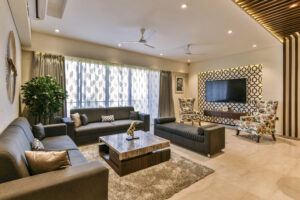
The wooden rafters finished in veneer starting from wall and continuing in the ceiling add a lot of warmth to the whole area smartly dividing the living and the dining area. All the furniture in the living and dining area is customized as per design requirements. The grey sofas, travertine finished table tops, blue dining chairs, and floral print master chairs slip into the whole space very well adding bright colors to space.
Travertine marble cladding with indirect lighting behind the seating ledge in the dining area adds amazing texture& warmth to the whole space with its variation in colors and veins.
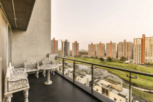
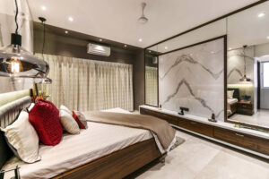
Terrace attached to the living area has grey tiles in the flooring with staggered tile joints and the terrace furniture is in white marble with inlay work purchased from Jaipur. 8’-0” X 4’-0” Statuario tiles are the main element in this bedroom as the same tiles serve as the
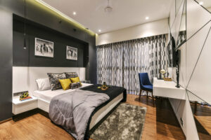
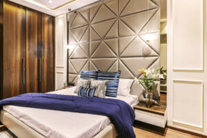
headboard for the bed back and backdrop for TV as well. Adding a mirror on both sides of the Statuario backdrop serves the purpose of dressing as well as gives a bigger perspective to the room by adding a lot of depth to space. The backdrop for the simple beds headboard is a dark grey with 2 paintings and 2 sleek pendant lights with soft lighting complementing the design of the bedroom. Opposite side of the bed had too many things like a door to the bathroom, a TV unit, and a dressing mirror, so to get this wall look huge was a challenge. With every effort, the design is build up for comfortable living.
Courtesy:
http://www.thespatium.com


GIPHY App Key not set. Please check settings