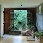
An apartment house in Mumbai designed by Designer Komal Sachdev
Navi Mumbai based Designer Komal Sachdev has designed an apartment for a business family which features almost exclusively a black and brown colour palette. The large square footage and rooms filled with natural light from the big windows justifies the use of dark colors as it brings in warmth and makes it easy to maintain for a family with young kids. There are many dramatic mind-blowing surfaces in this home along with refreshing pops of colors in the family’s favorite color – red – to break the monotony of black. Hint: powder room’s illusionary effect with black-and-white mosaic tiles. Stepping out from the elevator, guests are teased to a glimpse of the magnificent interiors that lies beyond. The large wooden framed glass door is flanked on either side by a fire brick-clad wall. A collection of mushroom-shaped wooden murals dots the wall on one side. The main door is fitted with horse-shaped handles as the horse symbolizes positivity as per Vaastu.
The doors open up to a public lobby area comprising two black shoe cabinets that mimic the chevron pattern in the wall behind and symmetric rectangles on the door leading to the main quarters. Illuminating the space is the smoked glass chandelier, a cluster of grey glass bulbs that offer a counterpoint to the straight lines around the house. A similar chandelier finds a place in the dining room.
Komal reasons by saying,” I believe in continuity of design throughout a space to ensure harmony. They may be splendid individual pieces of art but when put together, do they sing the same story?” Harmoniously put together and strung like exquisite pearls, the residence has a natural languor. A deluge of natural light from the 22-ft long window in the living room is balanced by the warmth of the exposed concrete wall, the black Italian marble flooring, the nested center tables, and the veneer paneling behind the TV. A pair of orange accent chairs set against the exposed concrete wall brings a refreshing zing of color. The master bedroom mirrors the children bedroom on the other side of the living. A classic combination of tan leather bed and Venetian concrete textured walls lends a luxe factor to the bedroom. The lounge comprises a seating area and an L-shaped bar counter below the window. The burgundy red fluted pattern makes a dashing impact in an otherwise ceiling-to-floor black room.
A gallery of psychedelic prints adds to the visual interest. A peninsula kitchen is adorned with Metroplitan grey quartz, acrylic shutters, and translucent black shutters. The powder room has a dramatic delusional impact on anyone who enters. Komal explains The powder room is designed for guests to be accessible from the lounge / entertaining area. We wanted to use a concept that one would least expect to find in a residence but blows away your mind. “ The black and white mosaic tiles, which is actually a 9X9 tile, has that impact. The head-spinning effect is amplified by running the tiles along the walls. The icing on the cake is the framed art print with hints of black and white patterns in it. The black ceiling and pair of lights complement the theme.
The kids’ bedroom shared by the three kids, a teenager and two really young ones, has touches of blush pink and baby blue. It is cleverly designed to age beautifully instead of wearing any over-the-top childish theme. The guest room speaks of warmth and is done in the classic combination of beige, cream, brown, and tan. A brilliant example of how to go bold with black, yet not make it claustrophobic.
Contact Details: www.komalsachdev.com


GIPHY App Key not set. Please check settings